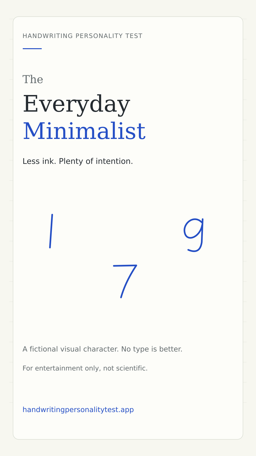
The Everyday Minimalist
Less ink. Plenty of intention.
For entertainment only, not scientific. This is a public type guide, not a personal result.
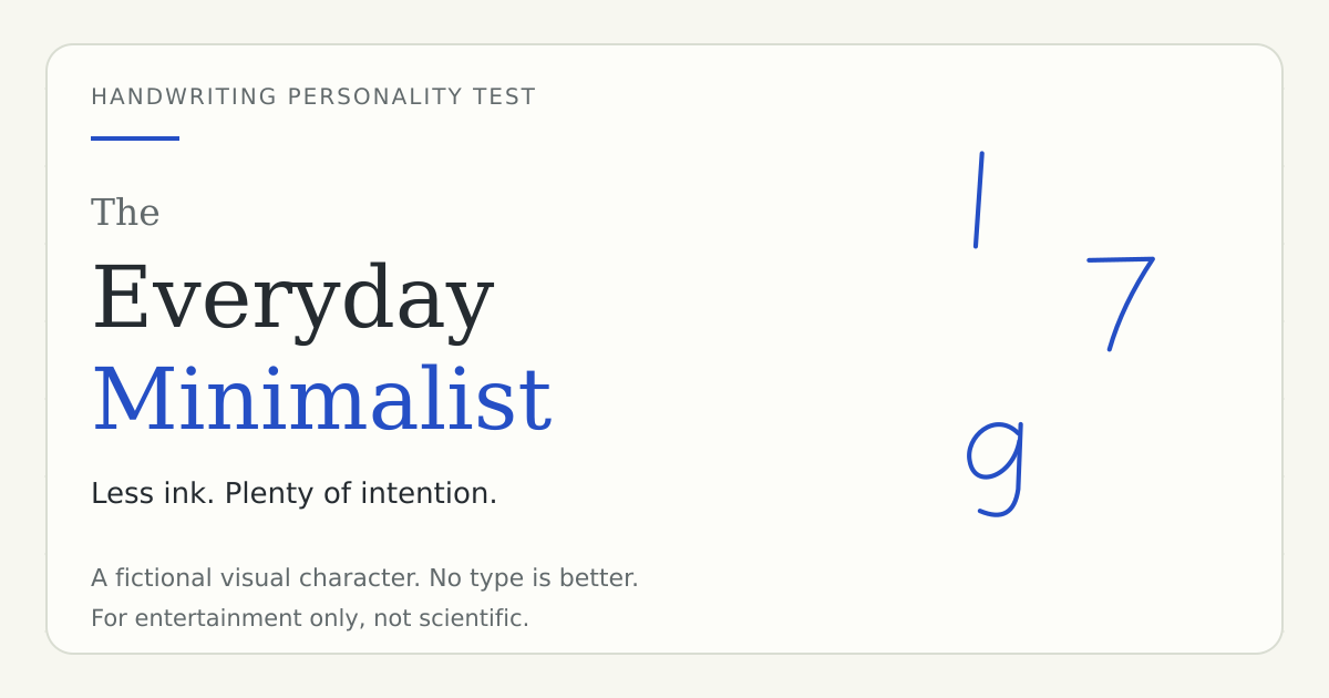
The Everyday Minimalist is our fictional character for economical-looking marks: the one that needs only a line, the seven without an extra bar, or the g that leaves its tail open. It celebrates a spare visual pattern rather than proving that a person is efficient, practical or emotionally uncomplicated. An elaborate detail can appear among otherwise simple choices. The result comes from the combination, not a rule that every letter must use the fewest possible strokes.
The visual cues behind the character
- Essential strokes and open endings
- Fewer added bars, bases or flourishes
- An unfussy overall visual impression
Minimal ink is a construction choice
A plain numeral one and an uncrossed seven remove details that other familiar versions include. An open g-tail ends without returning into a closed loop. These are visible differences in construction. They do not tell us whether the writer likes a tidy room, prefers short messages or avoids complicated problems. The minimalist character is a friendly way to name visual economy while leaving the much larger question of personality outside the scoring recipe.
Why one elaborate letter does not cancel the pattern
You might choose a simple one, an open g and a decorative ampersand. Real handwriting rarely follows one design principle without exceptions. The quiz combines all selected weights, so an ornamental symbol can sit inside an otherwise pared-back group. Inspect the answer breakdown rather than comparing yourself only with the three illustrative glyphs here. Those glyphs introduce the character; they are not a required checklist or an exact copy of every Minimalist result.
What the drawing mode adds to this character
A drawing match uses approximate geometry rather than a count of meaningful letter strokes. A faster moving trace can contribute a small reduced-finishing cue, while other available features influence flow and page rhythm. The tool does not know whether you omitted a seven crossbar. It also does not call speed a pressure measurement. Use the visible contribution list to understand the result and keep the distinction between a sparse-looking sample and an efficient person clear.
Try removing one detail without shrinking the message
Write a short note normally, then choose one finishing feature to simplify in a second version. You could leave a lower tail open or use a plainer numeral. Keep the wording and available space similar. Compare which details remain easy to read and which become ambiguous. The useful outcome is not a lower stroke count at any cost. It is a clearer understanding of which small marks help your particular message and which ones are mostly decorative.
A reflection that stays grounded
The character invites a question about communication: what could you simplify without losing something important? Your answer might concern a page layout or a confusing set of instructions rather than handwriting itself. That is an ordinary reflection prompted by a visual metaphor. It would go too far to claim that the open tail proves decisiveness, intelligence or a dislike of drama. A result that feels relatable can still be an invented story.
Compare economy with openness and mixture
Everyday Minimalist and Daydream Doodler can share some simple forms, but the latter puts more of the fictional emphasis on room and open rhythm. Instinctive Mixer represents a balance of several approaches. Those distinctions belong to the preset design space, not psychological boundaries between people. Try changing one answer and inspect the notes that move with it. A new type would demonstrate how the recipe responds, not that your actual personality has abruptly changed.
A gentle roast, not a diagnosis
You looked at the number 1 and thought, “One line is already plenty.” Your pen is on an extremely reasonable budget.
The roast is deliberately fictional. It is written for the character rather than inferred as a fact about you. Keep the joke only as far as it is enjoyable, and do not use it to explain another person's behavior.
A question to take away
What is one thing you could simplify this week without losing what matters?
How to get and inspect your own result
The sample-choice quiz asks twelve questions and needs at least eight selected answers. Its existing rules average visual contributions and choose the nearest preset pattern. Skipped questions do not become hidden selections. Your private result keeps the actual choices available to inspect, edit, save and compare.
The private drawing mode uses a different input and a separate transparent recipe. It estimates geometric features without recognizing the words or uploading the trace. Missing measurements contribute nothing. Both modes use these same six character names, but there is no guarantee that a chosen sample and a drawing on glass will produce the same match.
Common questions about this type
Is this a rare or better result?
No. The site makes no claims about rarity, user percentages or a hierarchy of personalities. It is a named visual pattern in an entertainment recipe.
Does this public page contain my answers?
No. This page describes the general character and can be visited by anyone. It contains no personal answers, handwriting image, coordinates, timing or pressure values.
Can handwriting validate the personality story?
No. The character is not a scientific assessment. The science guide explains the evidence boundary, and the methodology describes the original quiz rules.
Share the character, not private handwriting
These cards use the site's original illustrative glyphs. They do not show a user's drawing or selected answers. Choose the portrait card for a story-sized image or the landscape card for a link preview.