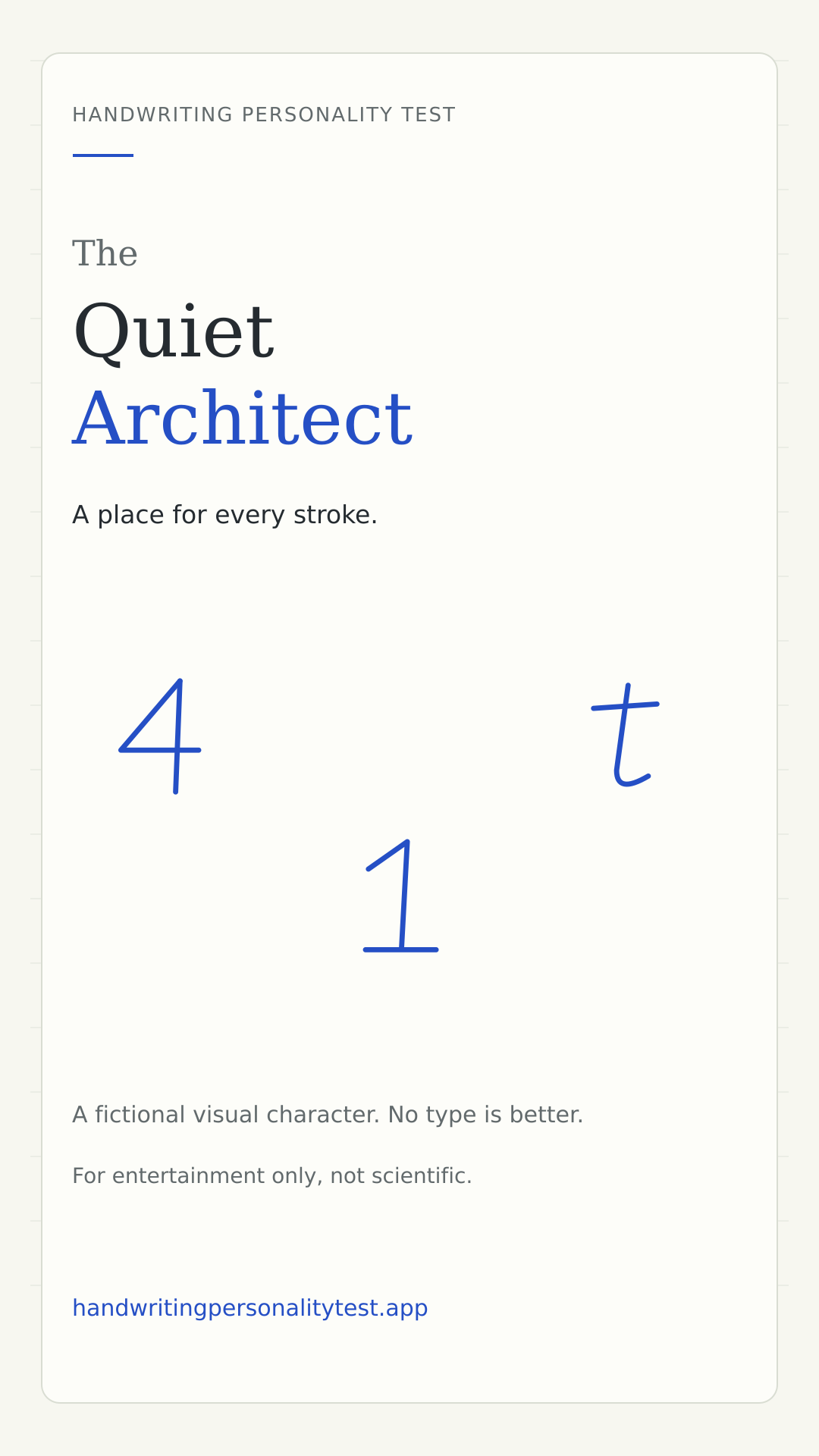
The Quiet Architect
A place for every stroke.
For entertainment only, not scientific. This is a public type guide, not a personal result.
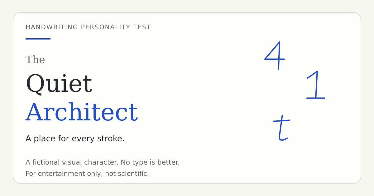
The Quiet Architect is our fictional portrait of contained, deliberate-looking forms. Think of a clear triangle in a four, an anchored numeral one, and a page whose details seem to know where to sit. The name celebrates a visual arrangement; it does not establish that the writer is organized, reserved or good at planning. A few flowing letters can still belong in this pattern. What matters is how the selected shapes balance across the whole recipe.
The visual cues behind the character
- Contained or angular constructions
- Compact visual rhythm
- Finishing details that look anchored rather than sprawling
What the architecture metaphor refers to
A closed four encloses a small triangle. A one with a base places an extra horizontal stroke near the writing line. Those marks can make a group of samples feel built or anchored. Calling that impression architectural is a design metaphor, not a claim about a mind. You do not have to keep a perfect notebook, enjoy spreadsheets or make careful plans to receive this result. The page is describing a pattern of marks rather than checking your habits outside the test.
Details that can support this result in the quiz
The example glyphs on this page illustrate contained forms and clear finishing strokes. Your personal result may use a different combination, because the quiz includes more choices than these three illustrations. One closed four cannot determine the outcome by itself. Review the individual answers on your private result page to see which shapes actually contributed. A looped g or open letter elsewhere can soften the pattern while the complete combination remains closest to this prototype.
What an Architect drawing match means
In drawing mode, this character can emerge when the measured geometry stays nearer the structured and compact parts of the editorial coordinate system. The tool is not detecting architectural skill, an orderly temperament or literal closed fours. It does not recognize words. Look instead at the local ink-height proxy, slant estimate and any available spacing value. The contribution list explains how those measurements moved the result. A missing measurement contributes nothing and should not be interpreted as evidence of restraint.
An experiment with space, not personality
Write a short phrase in a comfortable rectangle, then write it again with a little more room around the words. Try to keep the individual letters similar. Compare whether the extra space changes the overall impression without changing the familiar constructions. This exercise separates the shape of a letter from the layout of a line. There is no need to make your handwriting more structured to deserve the name, or less structured to escape it. The result is not an instruction to alter yourself.
A useful reflection and a misleading conclusion
A useful question is where a clear structure helps you communicate: a label, a list, or a heading that another person can scan. A misleading conclusion would be that your letter shapes prove you are reliable or suited to a particular job. The visual metaphor can prompt a conversation about preferences, but the answers should come from your experience, not from the triangle in a four. Keep the playful title only as far as you find it enjoyable.
Reading this type beside the others
Quiet Architect contrasts with Margin Storyteller in our fictional cast because contained forms and generous gestures make different visual impressions. That is not a ranking of practical people above imaginative people, or the reverse. A single writer can produce both kinds of page. Instinctive Mixer represents the central combination of cues rather than a failure to qualify for a stronger identity. Explore another type to learn the visual vocabulary, not to decide which label would sound more impressive in a group chat.
A gentle roast, not a diagnosis
You have absolutely rewritten a shopping list because the first heading looked slightly wrong. Even your scribbles probably have a filing system.
The roast is deliberately fictional. It is written for the character rather than inferred as a fact about you. Keep the joke only as far as it is enjoyable, and do not use it to explain another person's behavior.
A question to take away
Where does a little structure make your day easier? Where could you leave yourself more room?
How to get and inspect your own result
The sample-choice quiz asks twelve questions and needs at least eight selected answers. Its existing rules average visual contributions and choose the nearest preset pattern. Skipped questions do not become hidden selections. Your private result keeps the actual choices available to inspect, edit, save and compare.
The private drawing mode uses a different input and a separate transparent recipe. It estimates geometric features without recognizing the words or uploading the trace. Missing measurements contribute nothing. Both modes use these same six character names, but there is no guarantee that a chosen sample and a drawing on glass will produce the same match.
Common questions about this type
Is this a rare or better result?
No. The site makes no claims about rarity, user percentages or a hierarchy of personalities. It is a named visual pattern in an entertainment recipe.
Does this public page contain my answers?
No. This page describes the general character and can be visited by anyone. It contains no personal answers, handwriting image, coordinates, timing or pressure values.
Can handwriting validate the personality story?
No. The character is not a scientific assessment. The science guide explains the evidence boundary, and the methodology describes the original quiz rules.
Share the character, not private handwriting
These cards use the site's original illustrative glyphs. They do not show a user's drawing or selected answers. Choose the portrait card for a story-sized image or the landscape card for a link preview.